.webp?width=12693&height=4513&name=Sauce%20Logo%20Dark%20Ht%20(1).webp "Sauce logo")

.webp?width=180&height=64&name=Sauce%20Logo%20Dark%20Ht%20(1).webp "Sauce logo")

by Kim Garmon Hummel, on Feb 6, 2020 12:00:00 AM
The most iconic brands have one thing in common: keeping true to their brand identity. One of the most common and most crucial is the all-powerful logo.
A logo is the most influential image a brand has.
Your logo’s design has a huge effect on how customers and clients perceive your brand and whether or not they decide to buy your product or use your services.
This makes a lot of sense when you consider the word logo comes from the Greek word “logos,” which means “word.” The definition of logo design is taking a “word” (or brand name in the case of a logo) and creating a visual representation of that brand’s identity. And if we only have one word to make a good first impression, we better make it count. Word.
The Language of Color in Logo Design
The element of a logo that has the most influence – both psychologically and physiologically – is color. It takes 90 seconds for a person to form an opinion on a product and 62-90% of that is determined by the color. When color is applied correctly in design, it can have a massive influence on emotion and even encourage action – like clicking on a button to purchase a product online.
So, what are these factors that influence our reaction to color?
- Cultural understandings. Our interpretation of color is heavily influenced by our cultural background. For example, let’s look at the color blue. In America, our prime corporate blue exudes coolness and professionalism. Yet, in East Asia blue is considered to carry associations of evil and sinister behavior. If you have a global market, this is why you need to devote serious research to the color of your logo before launching it into the world.
- Personal experiences. Secondly, there are the finer details that affect our impressions that brands can’t always identify: the personal experiences that we attach to certain colors. Here’s an example: Mary grew up in a yellow-colored house and has great memories of her childhood while living there. Now she associates the color yellow with good things, even later in life, and seeing the color evokes positive feelings for her. Do you see how this could get pretty complicated?
Choosing the correct logo color
By now you’re probably asking: With so many factors constantly shaping our opinions of color, how do we make the right choice for a logo? That’s a valid question. But an even better one to ask is:
How can I use color to attract my target audience and trigger a specific emotion?
Let’s look at the experts. The most successful brands have logos that are not only aesthetically pleasing but also able to prompt an emotional response from an audience.
Although a wide range of cultural and personal experiences abound, there are a few universal color guides that pull from color psychology and have stood the test of time.
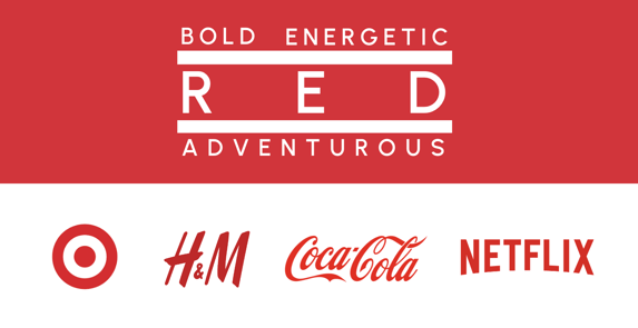
Red: Logo Design Color Analysis
Red demands immediacy. It represents love, passion, romance, danger, and energy. Its physiological reaction is similar to that of an adrenaline rush. Fast-food chains are notorious for using red to trigger your appetite (looking at you, McDonald’s), while other brands use the color to target TV binge-watchers (Netflix) and shopaholics looking for a reason to treat themselves (Target, H&M).
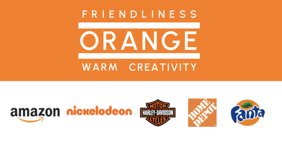
Orange: Logo Design Color Analysis
Orange oozes warmth and innovation. For brands like Nickelodeon and Fanta, their logos inspire playfulness which appeals to their young audiences. Alternatively, Harley Davidson features orange on their logo (paired with the ever sophisticated black) to match the free-spirited lifestyle their products provide.
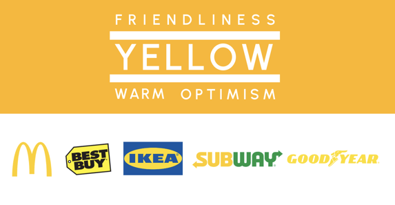
Yellow: Logo Design Color Analysis
Optimistic outlooks, friendliness, and imagination are all tied to the color yellow. Yellow is a bright attention-grabber, frequently used for call-to-action buttons on websites. Careful, though – yellow is a color where a little goes a long way. Why? Some research suggests that certain tones of yellow can induce anxiety, a physiological reaction most brands probably aren’t looking to produce in their target audience.
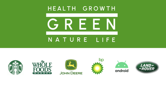
Green: Logo Design Color Analysis
Green is one of the most common colors we see marketed these days with the world’s growing focus on sustainability and health-conscious choices. It represents health, prosperity, nature, and freshness. Chances are that if it has anything to do with being healthy, the logo is going to be green.
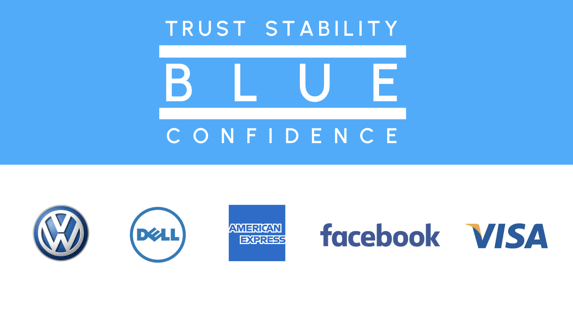
Blue: Logo Design Color Analysis
Blue is also one of the most commonly used colors in logo design. Businesses of technology, automotive, and finance all use blue to project confidence, integrity, and stability. These businesses are historically male-dominated fields, so it’s no surprise they chose blue since it’s men’s most preferred color choice.
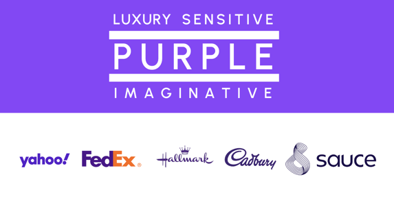
Purple: Logo Design Color Analysis
Luxury, magic, and the finer things in life – purple projects the notion that if you have this product or service of ours, others will know your wealth and elegance. Purple is women’s most preferred color choice, which many companies like Cadburry and Hallmark have leveraged in order to reach that target audience.
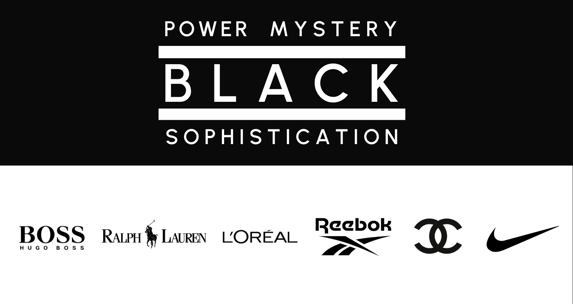
Black: Logo Design Color Analysis
Black – so very mysterious. All jokes aside, black represents power, sophistication, mystery, and sometimes even death. Brands that use black want to portray a level of eliteness that’s exclusive to only those who partake in their service or product. Black has been used by some of the world’s most luxurious brands – think Chanel, Prada, and Gucci – to attract the world’s most elite clientele.
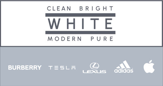
White: Logo Design Color Analysis
You may be thinking that white isn’t a color, but that’s far from the truth. White exudes modern innovation; over the years, it’s become the color of the future. Brands like Tesla and Apple have claimed white to give their products a pure, unscathed, first-of-its-kind appeal that buyers have grown to crave.
The Power of Color
Throughout history and time, color has played a huge role in how we perceive the world. Color can evoke an emotion, trigger a physical reaction, and affect how we feel towards something as big as a brand (whether good or bad).
Brands that use the correct color in their logo design can expect a positive reaction from the audience they’re trying to attract—and the companies who ignore the importance of color can expect the opposite.
Though color alone does not make up a logo and there are many other components (including font, which I cover here), you can’t deny that color is the most powerful tool in a graphic designer’s arsenal.
Want to take the Psychology of Logo: Color infographic with you? Click here to download the free PDF.
Design a Brand that Beckons with Team Sauce
Ready to launch a rebrand, or start a logo design from scratch? At Team Sauce, we take brand market research, psychographic data analysis, and design psychology to the next level. We help you craft a Brand that Beckons—a magnet that attracts your ideal customer AND ideal employees while communicating your organization's mission and vision. Schedule a Connect Call today to get started!